

WORK
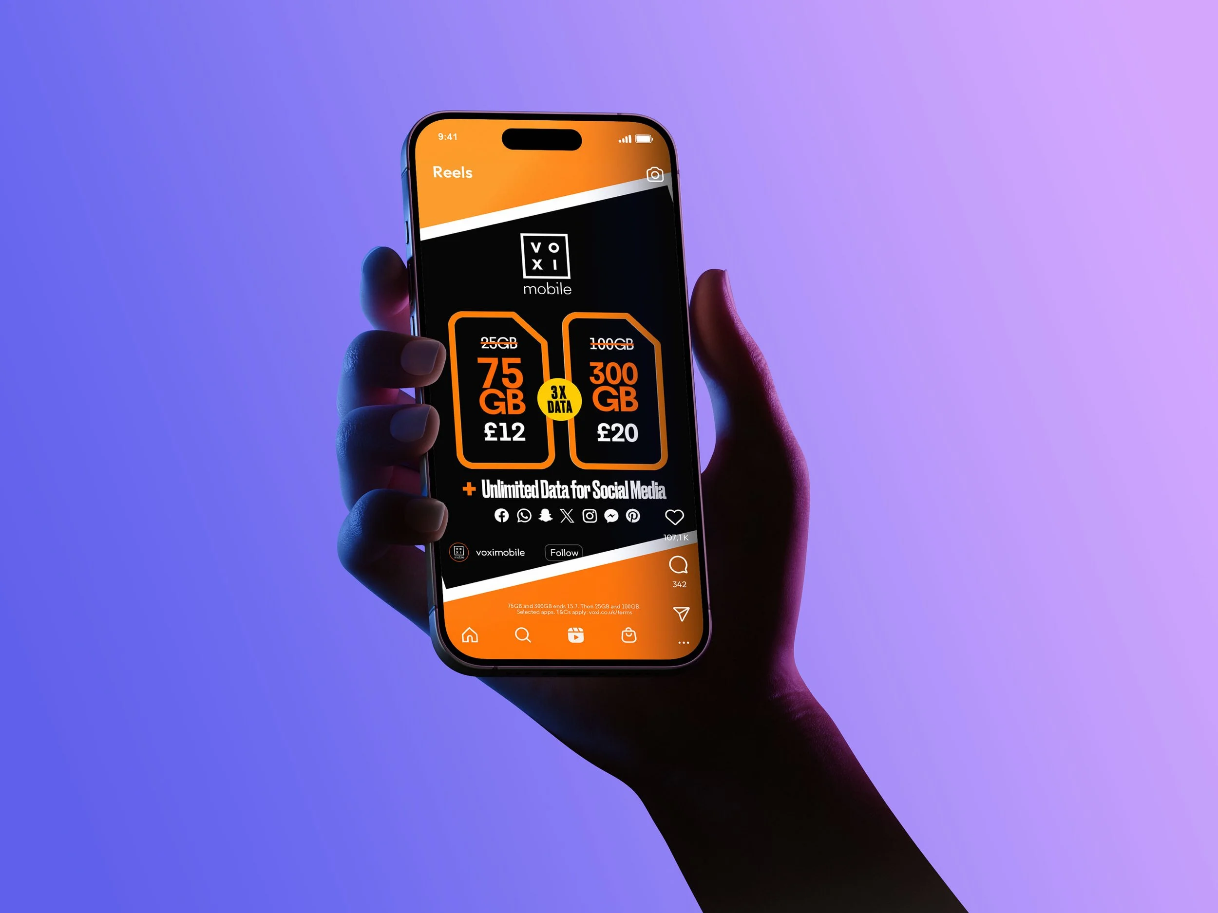
CAMPAIGN CREATIVE AT VOLUME
SERVICES
Art Direction
Design
Client
VOXI by Vodafone (via AMV BBDO / freelance)
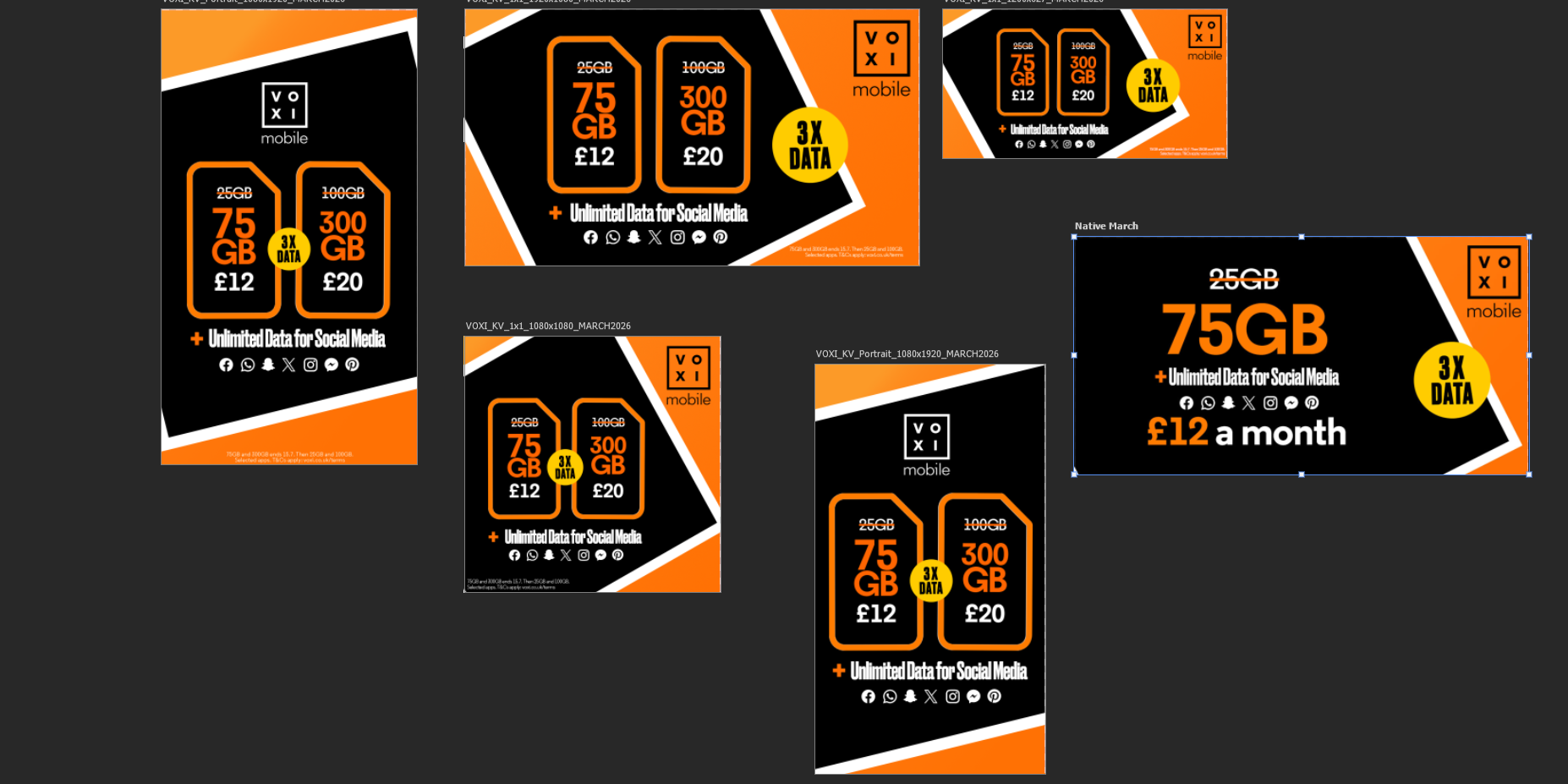
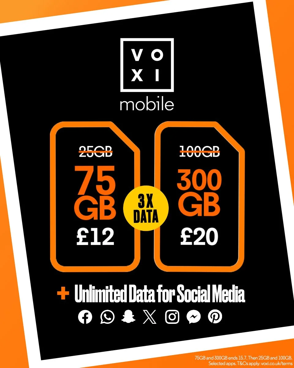
VOXI ships campaign creative constantly: fifty-plus assets a month across a dozen social and paid placements, static, animated, story, carousel, banner and all of it has to feel like one brand.
Monthly campaign rollouts at that volume, platform-ready, without drift. Volume needs a system behind it; without one, consistency is the first casualty.
THE BRIEF
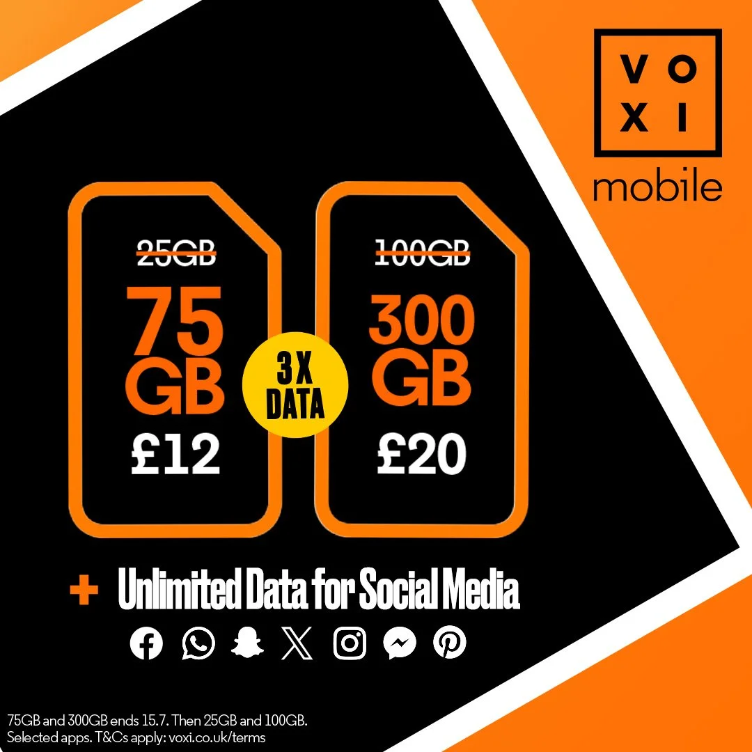
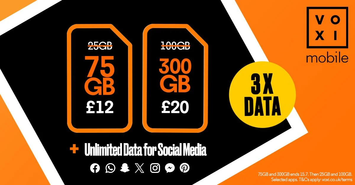
Everything started from one key visual per campaign theme, a single image strong enough to carry the core message alone and survive being cut into every format downstream. Once that was settled, every placement inherited it. A story frame, a carousel, an animated multiplan and a static banner share nothing structurally, but each resolved back to the same visual principle.
Production was built around smart-object file architecture, so each monthly rollover was a controlled update rather than a rebuild. Client rules on asset usage and animation durations were designed into the templates, not bolted on after.
One deliberate break from the brand guidelines: a signature colour for each month's promotional label May was purple. It worked as a pattern-breaker in the feed and as built-in quality control: an asset in the wrong colour was instantly, visibly out of place. The system policed itself.
THE APPROACH
VOXI BY
VODAFONE
KEY VISUALS
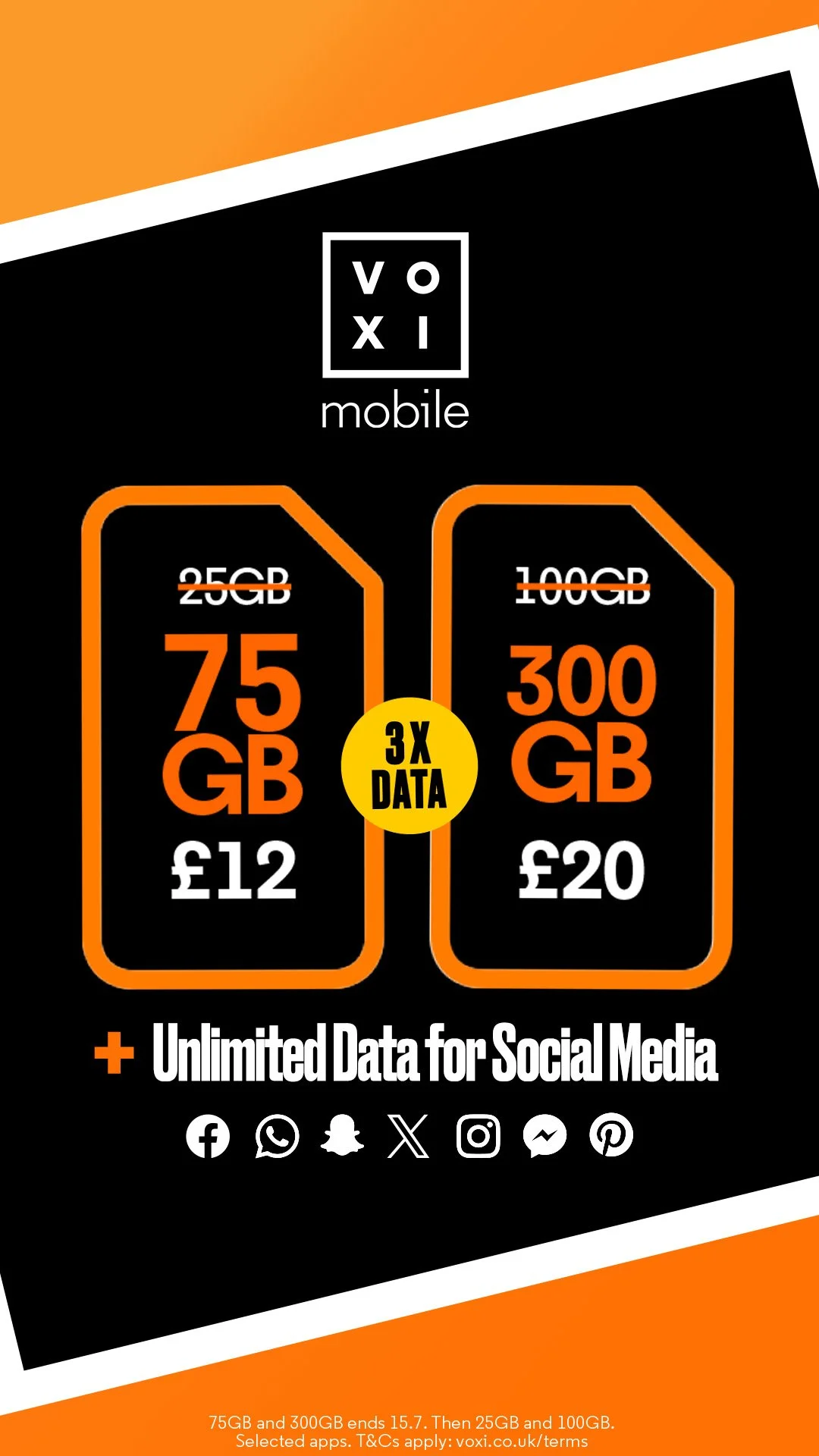
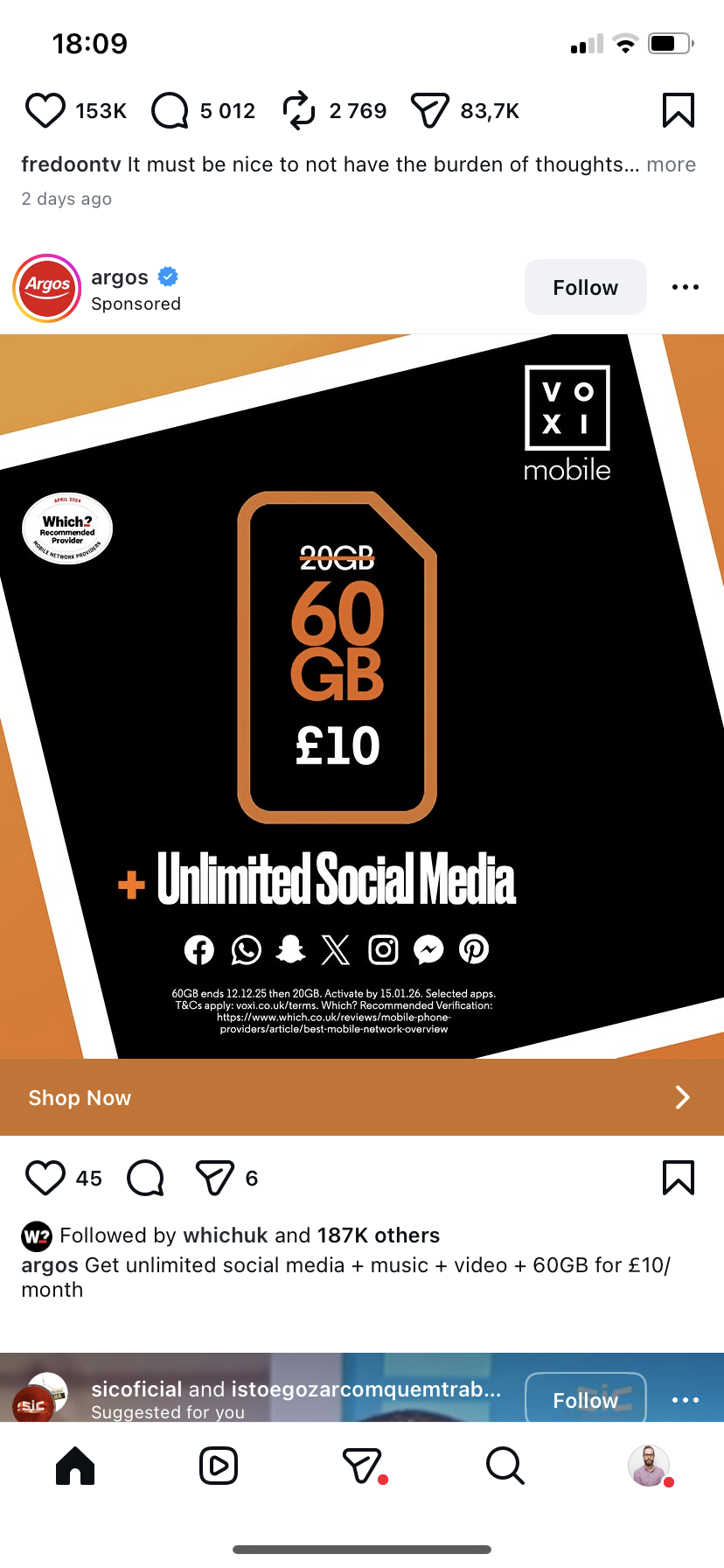
Every campaign started here. One image, built to carry the message on its own, and built to survive being cut into fifty other things. The key visual isn't the hero shot it's the source code. Get it right and every asset downstream inherits its logic. Get it wrong and you spend the month firefighting.
MOTION
Animated multiplan sets, built to client-specified durations and platform requirements. Movement that serves the message a plan, a price, a reason to look rather than movement for its own sake. Motion is where most brands lose their composure. The temptation is to make things move because they can.
PLATFORM-NATIVE
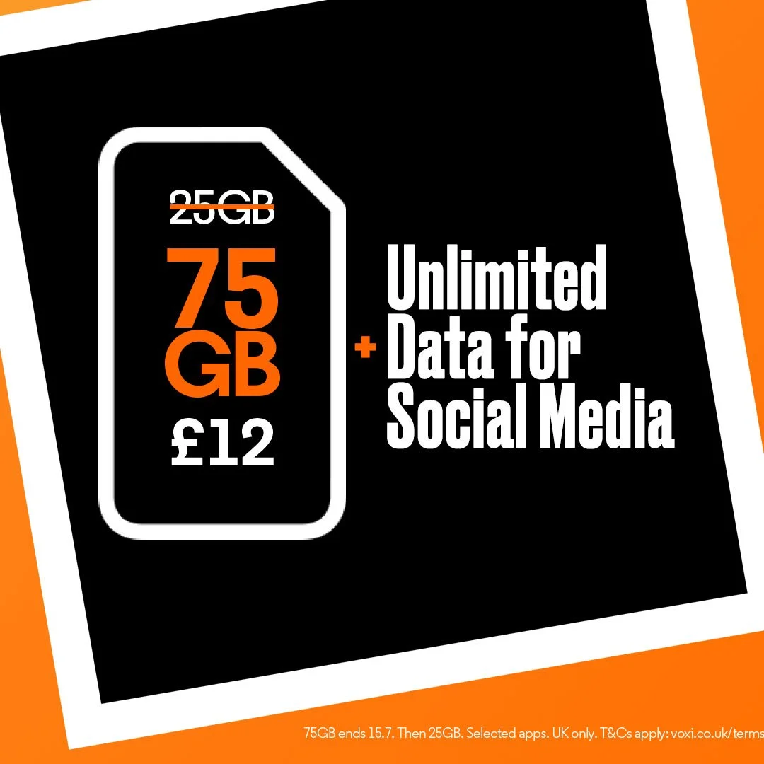
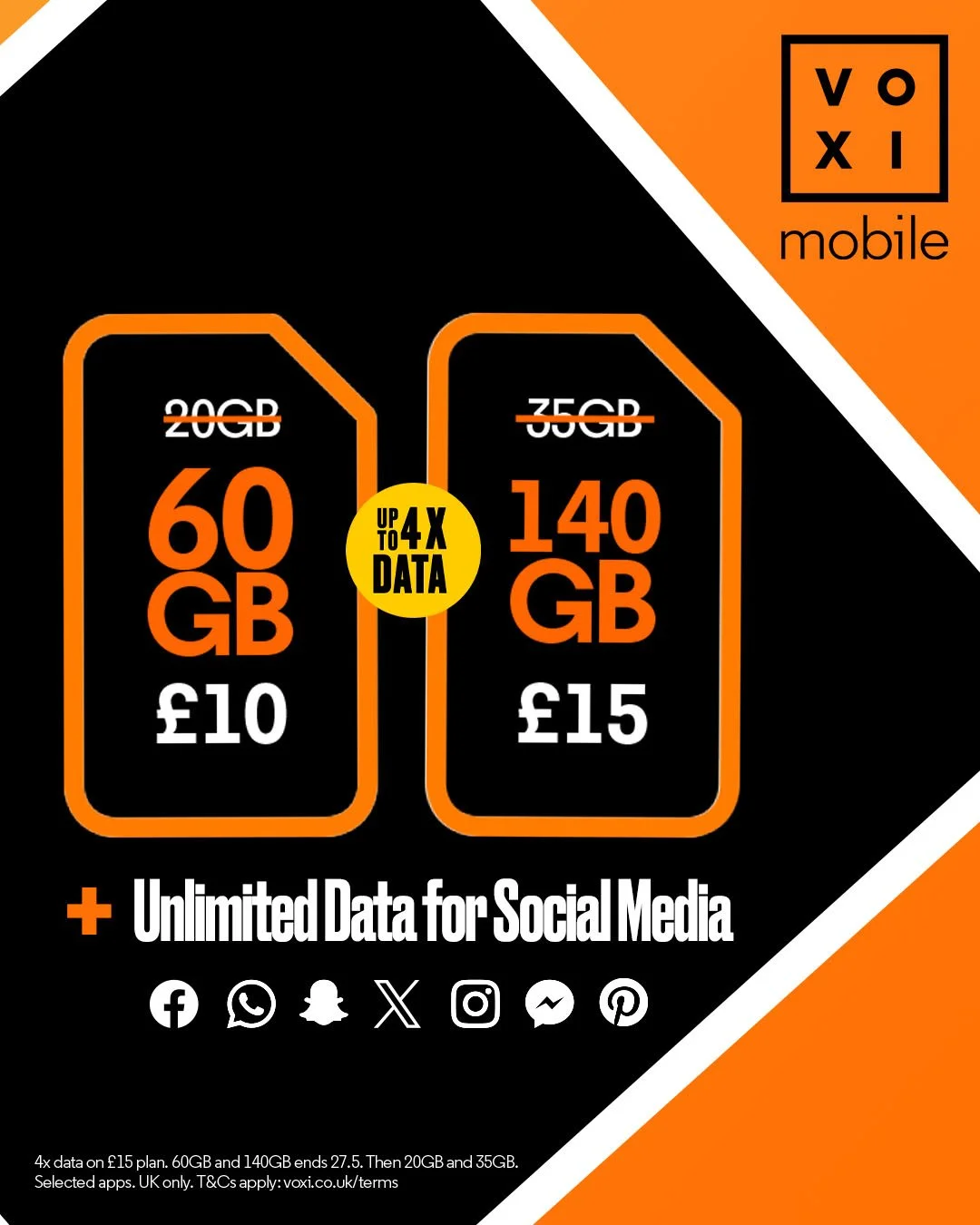
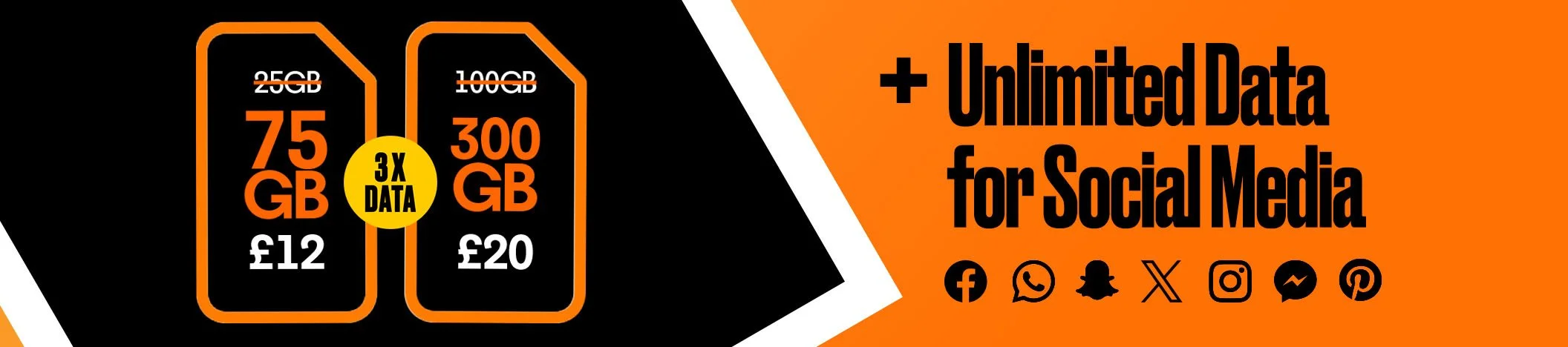
Instagram carousels, shoppable posts and in-feed formats designed to behave like the platform, not like an ad dropped into it. Different rules, different rhythm, different expectations from the person scrolling. An asset that fights its placement loses.


SCALE
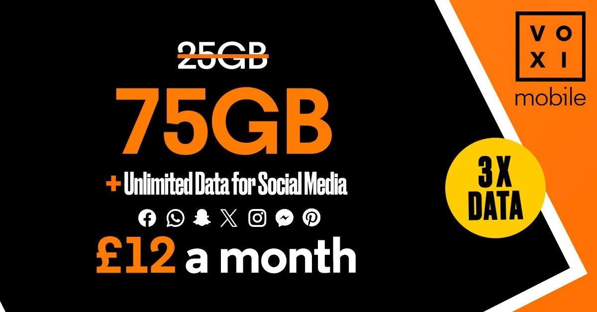
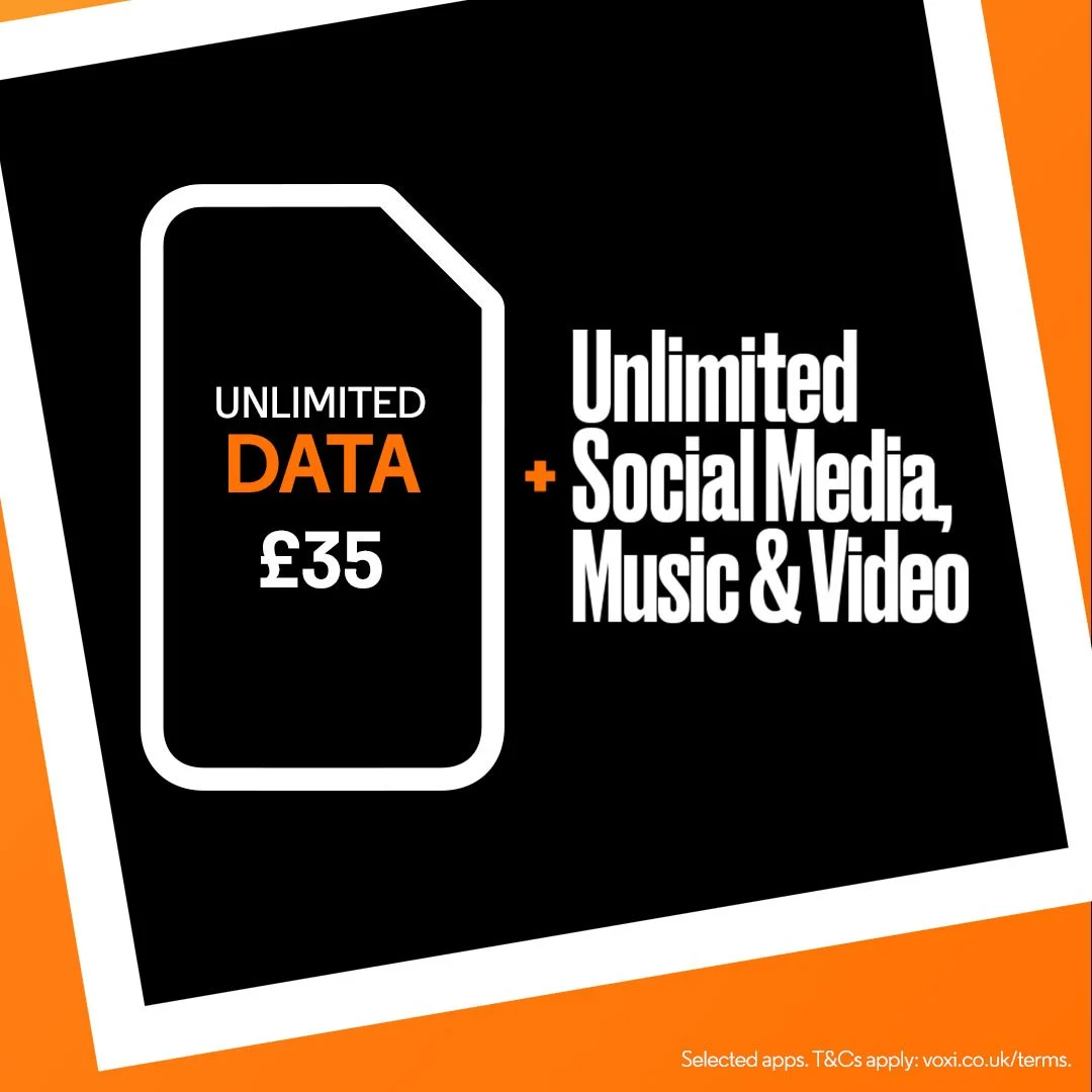
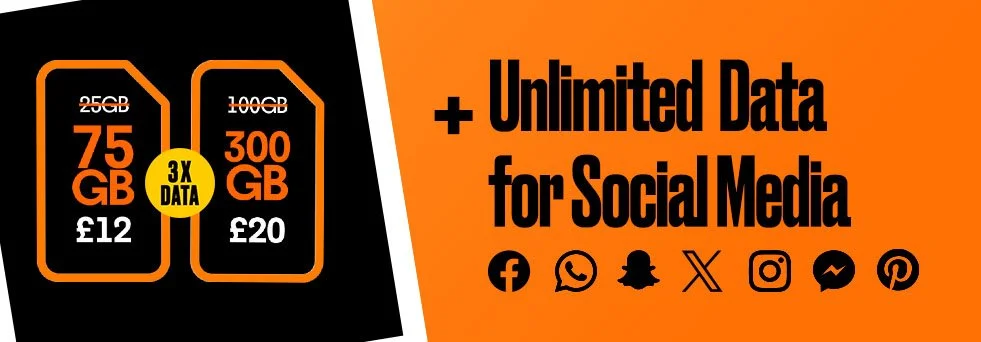
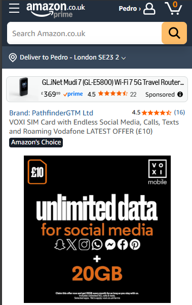
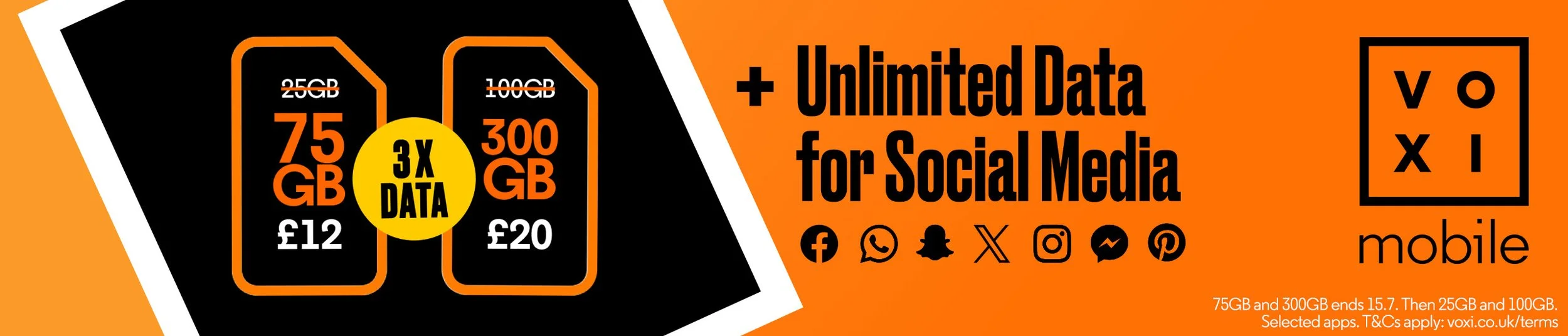
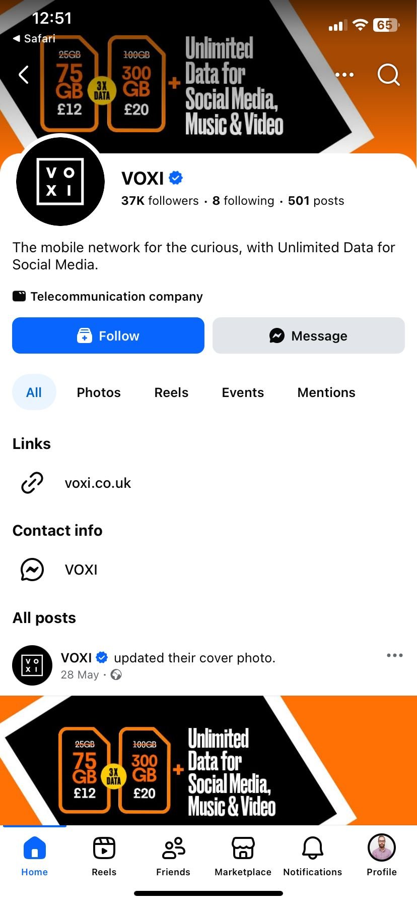
Website banners, native, base comms, PMAX, retail, social headers, the same campaign, holding its shape across every placement a telecoms brand buys. This is the part nobody sees and everybody feels. Fifty-plus assets a month, every one of them recognisably the same brand.


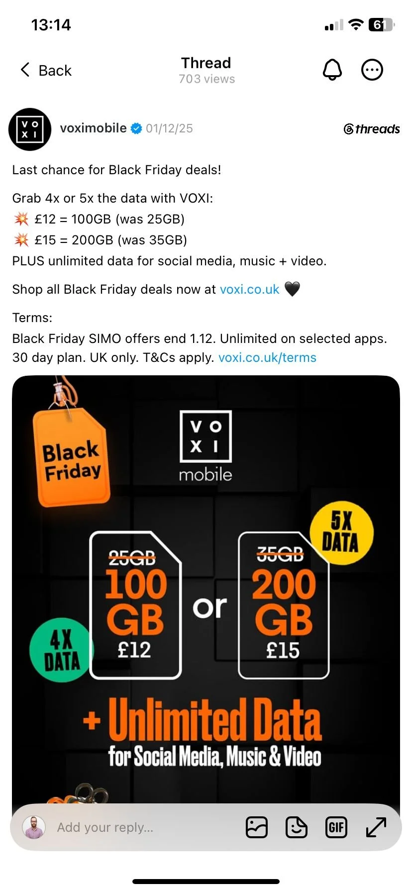

THE COLOUR SYSTEM
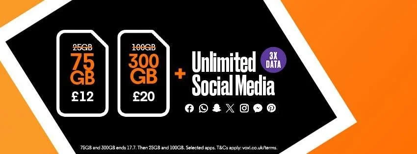
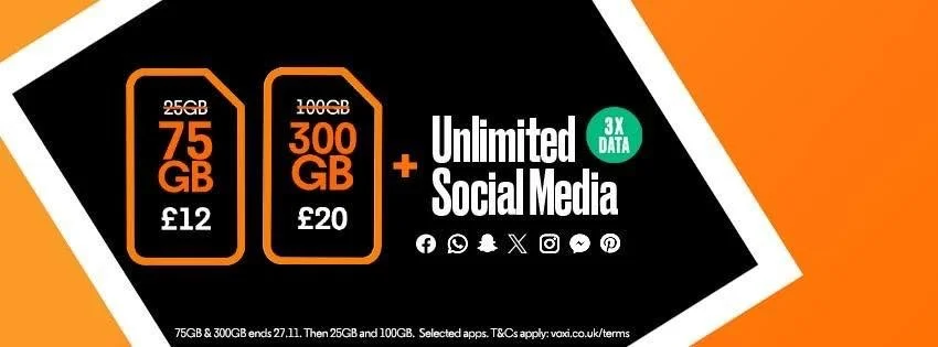
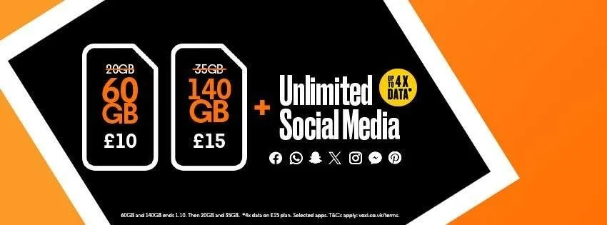
A deliberate break from the brand guidelines: a signature colour for each monthly cycle. May was purple. It worked as a pattern-breaker in a crowded feed and as quality control. If an asset appeared in the wrong colour, it was instantly, visibly wrong.
It also allowed us for some seasonality playfullness

FROM ZERO ONLINE PRESENCE
THIRTEEN MONTHS WITHOUT A MISS.
"Thirteen monthly campaign cycles, fifty-plus assets each, across a dozen placements, every one delivered on time. The system is still running today, without me on it."
Every deadline across thirteen months was met, but the more significant outcome is what happened after: the system kept running without its designer. New campaigns still roll through the same key-visual logic, the same file architecture, the same self-policing colour cues.
That's the test of systems work, not whether it performs while you're in the room, but whether it survives you leaving it. This is what design at volume looks like. Not fifty deliverables a month, one system that produces them.
Be seen.
Let's talk.
Want a full overhaul, or just an honest read on why your marketing isn't converting? It starts with a conversation, no pitch, no pressure.
No commitment on the first call. / Straight to the founders / We reply within 24 hours