
A brand built to
compete with the big names.
In three weeks.
LBW Tutoring needed an identity that could sit alongside established national competitors — and make parents choose them first. We built the whole brand system from scratch.

Standing out in a
crowded, trusted market.
The UK tutoring market is dominated by well-funded national platforms — Tutorful, TutorChase, Preply, GoStudent. They have brand recognition, large budgets and years of trust built up with parents and schools.
LBW Tutoring's strength is the opposite of all of that — deeply personal, one-to-one, tailored to each student. The brand needed to communicate that difference immediately, without looking like a scrappy alternative. It needed to look like the premium choice.
The brief: build a complete brand identity from scratch. Logo, colour system, typography, guidelines, and every touchpoint applied — in three weeks.
"Most tutoring brands look either corporate and cold, or soft and amateur. LBW needed to feel like both a trusted expert and a personal partner — sophisticated enough for schools, warm enough for parents."
LBW was starting from zero — no logo, no colour system, no visual language. Everything needed to be created and justified from a strategic brief, not inherited from previous work.
Parents want warmth and trust. Schools want professionalism. Adult learners want confidence. The brand needed to speak to all three without feeling generic to any of them.
LBW are three initials with no obvious visual story. The identity needed to transform them into something meaningful — a mark that communicated the brand's educational mission at a glance.
Strategy first.
Then the logo.
We started with competitor analysis — mapping the visual language of every major tutoring brand in the UK market. What we found: almost all of them used either cold corporate blues and whites, or playful, student-facing palettes.
The gap was premium warmth. A brand that felt established and trustworthy — but personal and human. That became the strategic brief for every design decision that followed.
Only once the strategy was agreed did we design the mark.
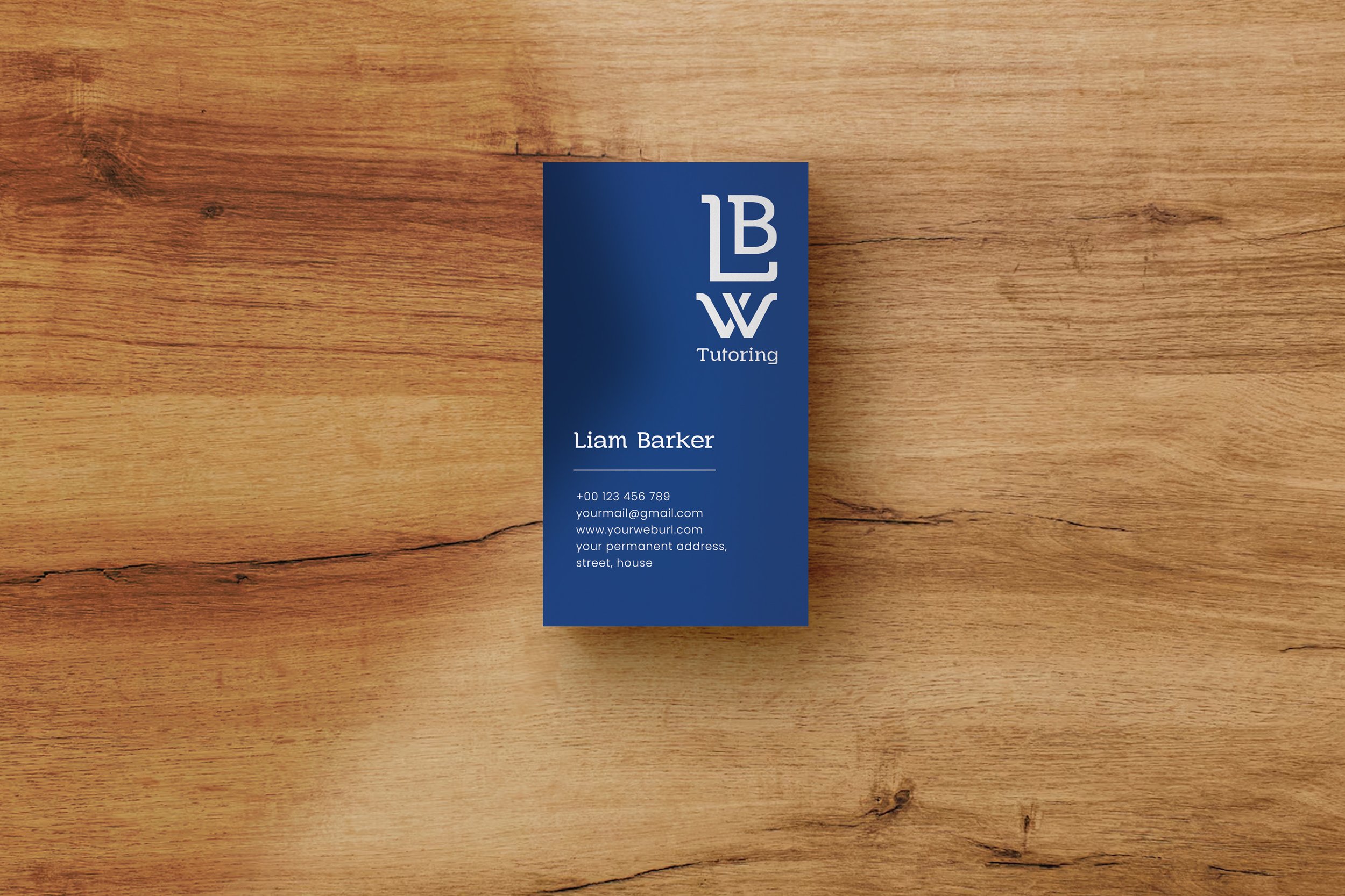
The custom W in the logo forms two open books facing each other — symbolising the connection between student and tutor, and the open exchange of knowledge. Not a decorative choice. A strategic one that communicates the mission without words.
While competitors used bright, digital-native palettes, LBW's deep navy (#114483) was chosen specifically to signal authority and trust — the colour of established institutions. It positions LBW alongside Keystone Tutors and premium school brands, not Preply.
A modern serif with rounded edges — sophisticated enough to appear professional in school communications, warm enough to feel approachable to parents and students. Paired with Poppins for body copy across digital and print.
The identity was stress-tested across business cards, branded stationery, pens, notebooks, billboards and the website before sign-off. If it didn't work at every scale and in every context, it went back to the drawing board.
A complete brand system.
Applied everywhere.
Every element of the LBW identity was designed to work across digital, print, outdoor and branded merchandise — cohesive at every scale and in every context.


A complete brand system.
Ready to use on day one.
Primary mark, icon, horizontal and stacked lockups — all variants for every context
Primary and secondary palettes with usage guidelines for print and digital
Heading and body typefaces with hierarchy rules and usage examples
Full document covering brand values, voice, tone and visual application rules
Business cards, letterhead and branded stationery — print-ready files
Branded notebook and pen — applied and ready for production
Billboard and outdoor signage — brand applied at large scale
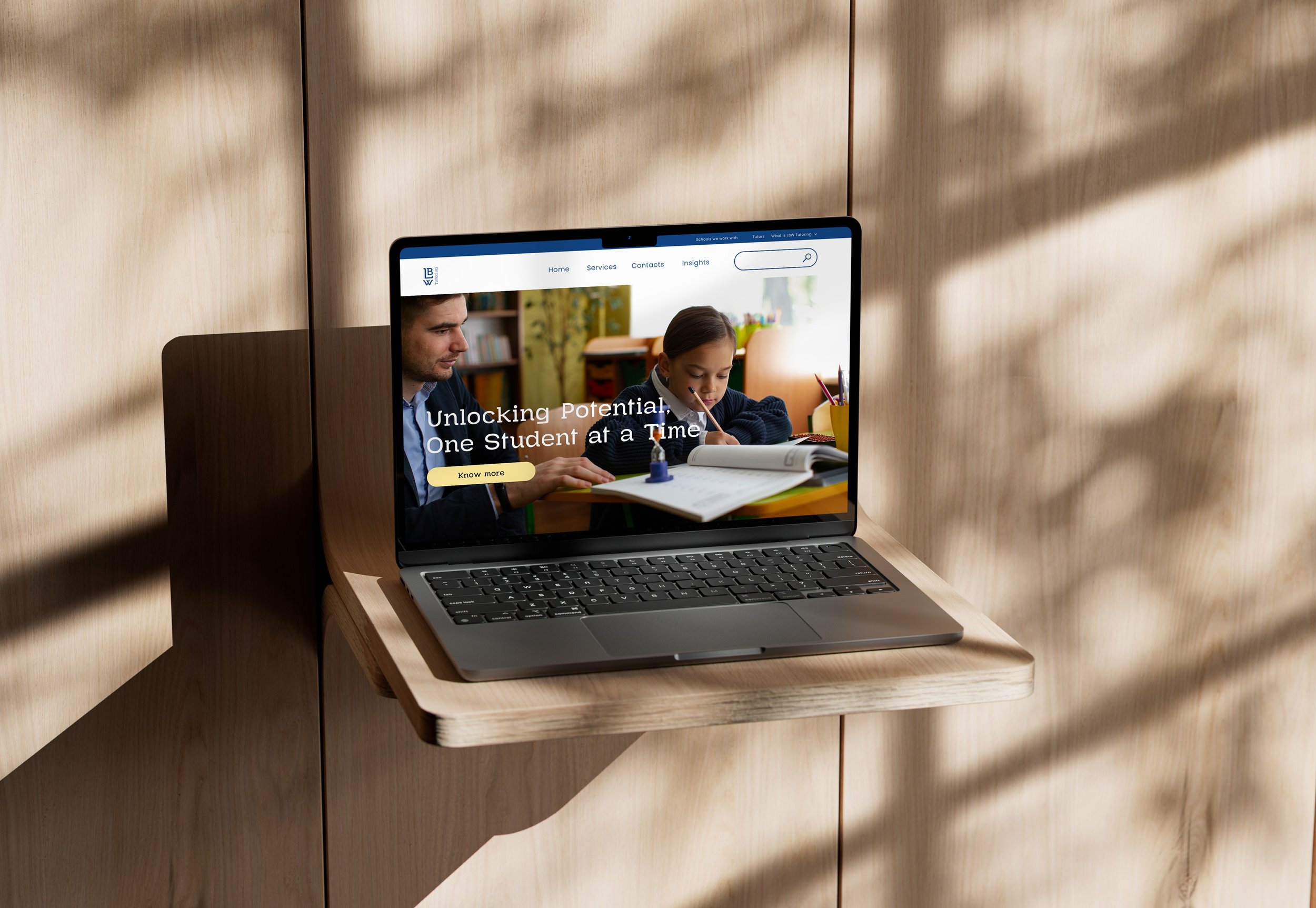
Homepage design mockup showing how the brand translates to digital
Brand brief, competitor analysis, audience mapping, design direction agreed
Logo concepts, colour system, typography, lockup variants, refinement
All touchpoints applied, guidelines written, final assets packaged and delivered
A new brand that looks like
it's been there for years.
"The goal was never to look like a startup. LBW needed to look like the trusted choice — established, expert, personal. The identity we built positions them to compete with national brands from day one."
In three weeks, LBW went from no brand to a complete, professional identity that works across every context they'll need — from school communications and parent-facing materials to outdoor advertising and branded merchandise.
The website build is next. The foundation is already there.
Before we design anything, we make sure we understand your audience, your positioning, and what your brand needs to communicate. The audit gives you that foundation — fast.
Book the Clarity Audit ← Back to our work