

LBW
TUTORING
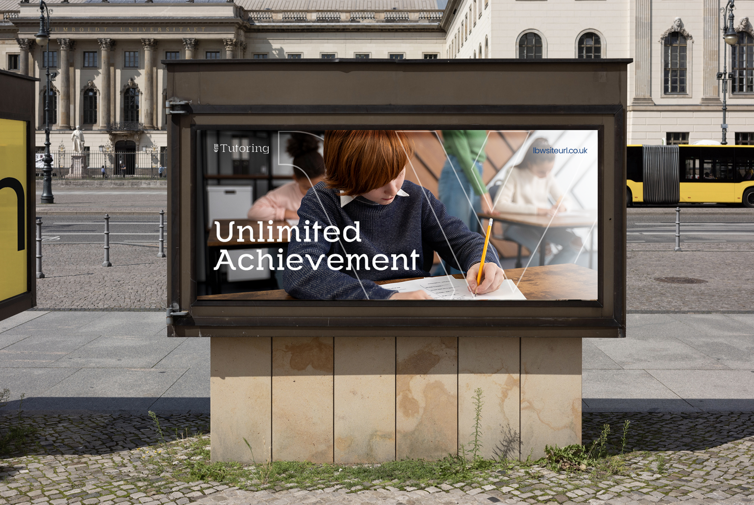
CAMPAIGN CREATIVE AT VOLUME
SERVICES
Brand strategy
Logo design
Identity design
Art direction
Client
LBW Tutoring
The UK tutoring market is dominated by well-funded national platforms. They have brand recognition, large budgets and years of trust built up with parents and schools. LBW Tutoring's strength is the opposite of all that. It offers deeply personal, one-to-one teaching that’s tailored to each student. When they approached POW, they explained how they needed to showcase their unique offering with premium branding.
Build a complete brand identity from scratch in three weeks, including a logo, colour system, typography and brand guidelines.
THE BRIEF
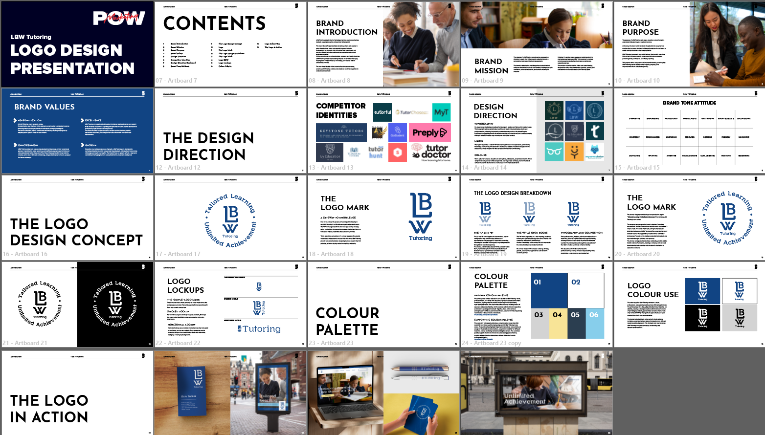
Strategy first. Then the logo. We started with competitor analysis, xamining the design of the biggest tutoring brands in the UK. We needed to find a gap in the market, and analyse how we could visually communicate that LBW Tutoring is established and trustworthy, but personal and human. That became the strategic brief for every design decision that followed. Once the strategy was agreed upon, we started work.
THE APPROACH
THE RESEARCH
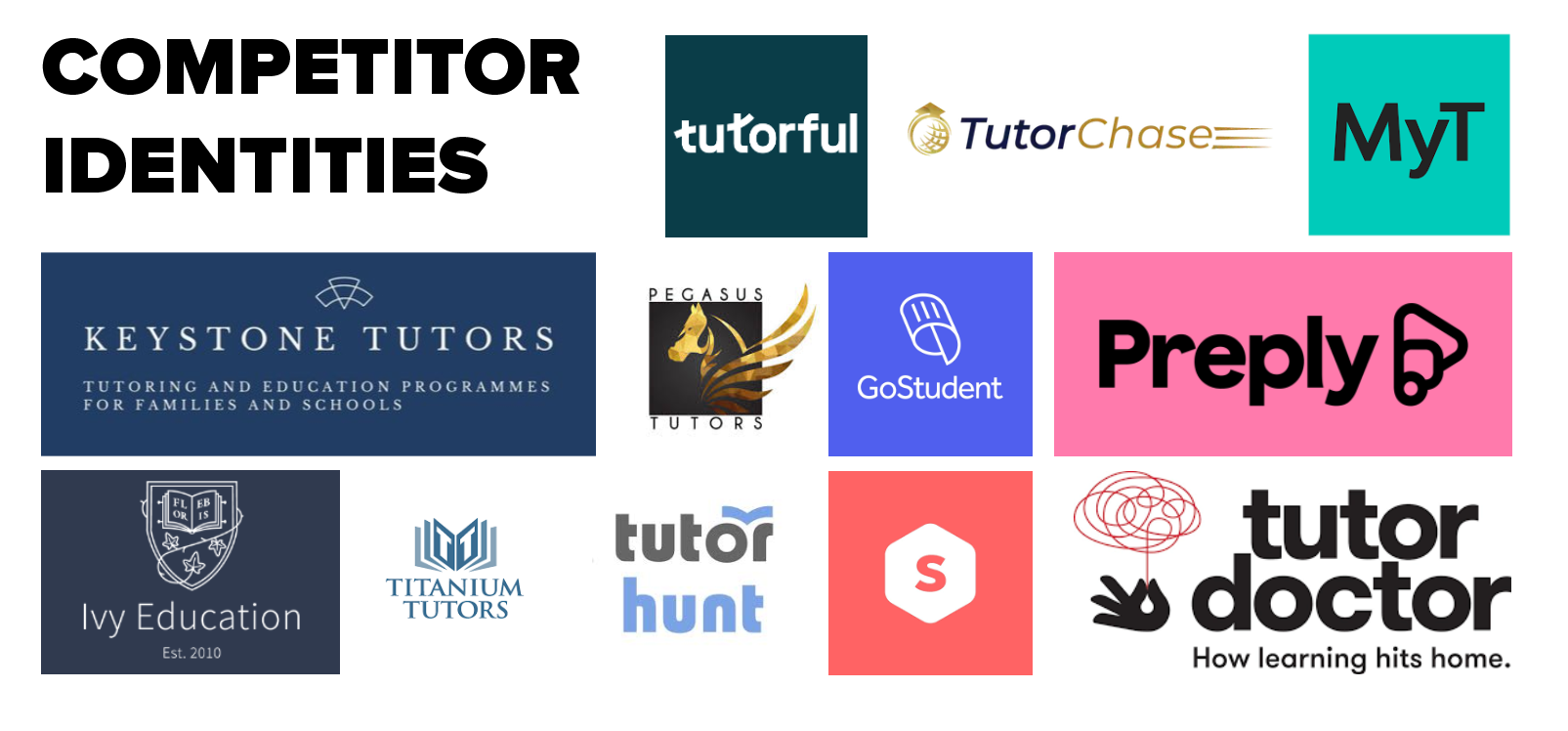
We mapped the visual identity of major UK tutoring businesses. Almost all of them sit at one of two poles - cold corporate blues and whites, or playful and informal palettes. We realised the gap was a premium brand with warmth. That gap became the brief.
BUILDING THE MARK
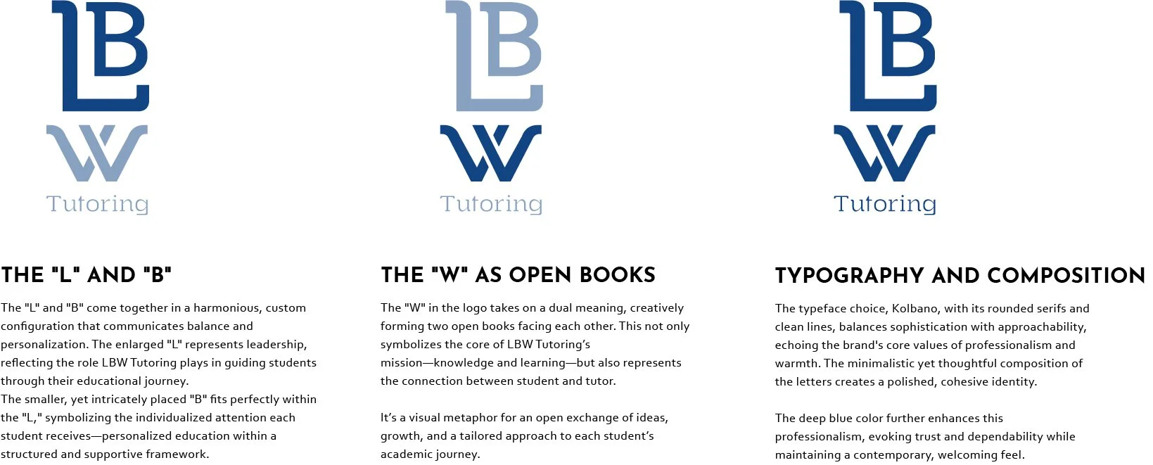
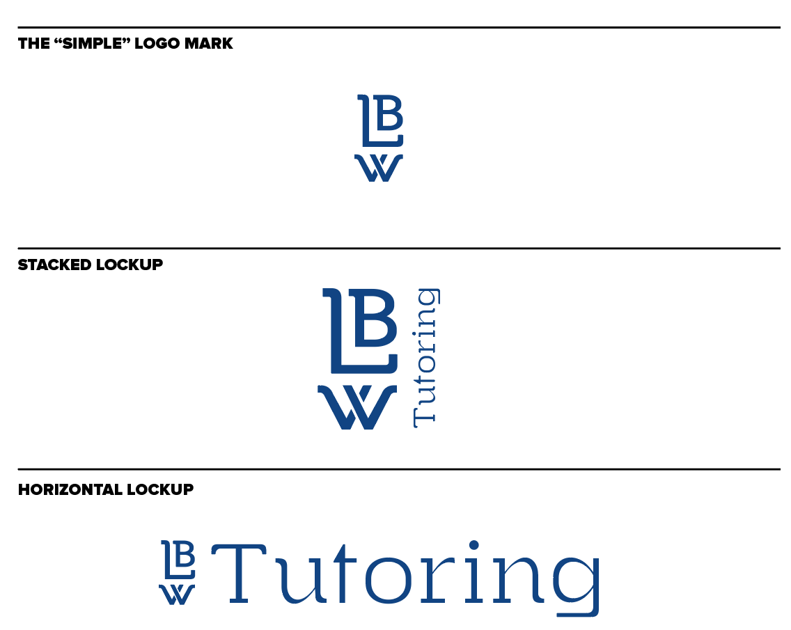
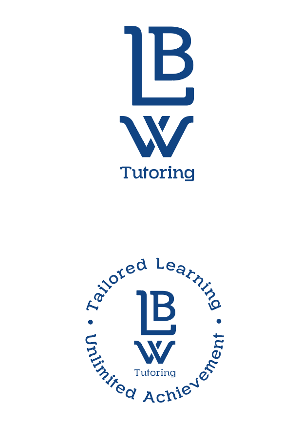
The custom W in the logo forms two open books facing each other, symbolising the connection between student and tutor, as well as the open exchange of knowledge. It offers a visual story that communicates the brand's educational mission without words.
THE SYSTEM
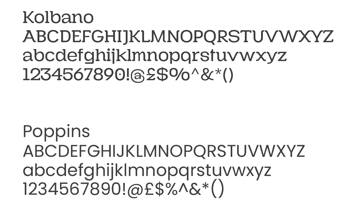
We chose deep navy to mimic the colour of established institutions, positioning LBW alongside premium schools not apps. For the font, Kolbano was used for headlines and Poppins for body copy. Both are sophisticated enough for school communications, yet inviting.
Colour Pallette
Dark Cerulian
#114483
Dark Blue Grey
#2b3e50
Quill Grey
#d3d3d3
Golden Glow
#f8e497
Light CornflowerBlue
#f8e497
White
#114483
IN THE WILD
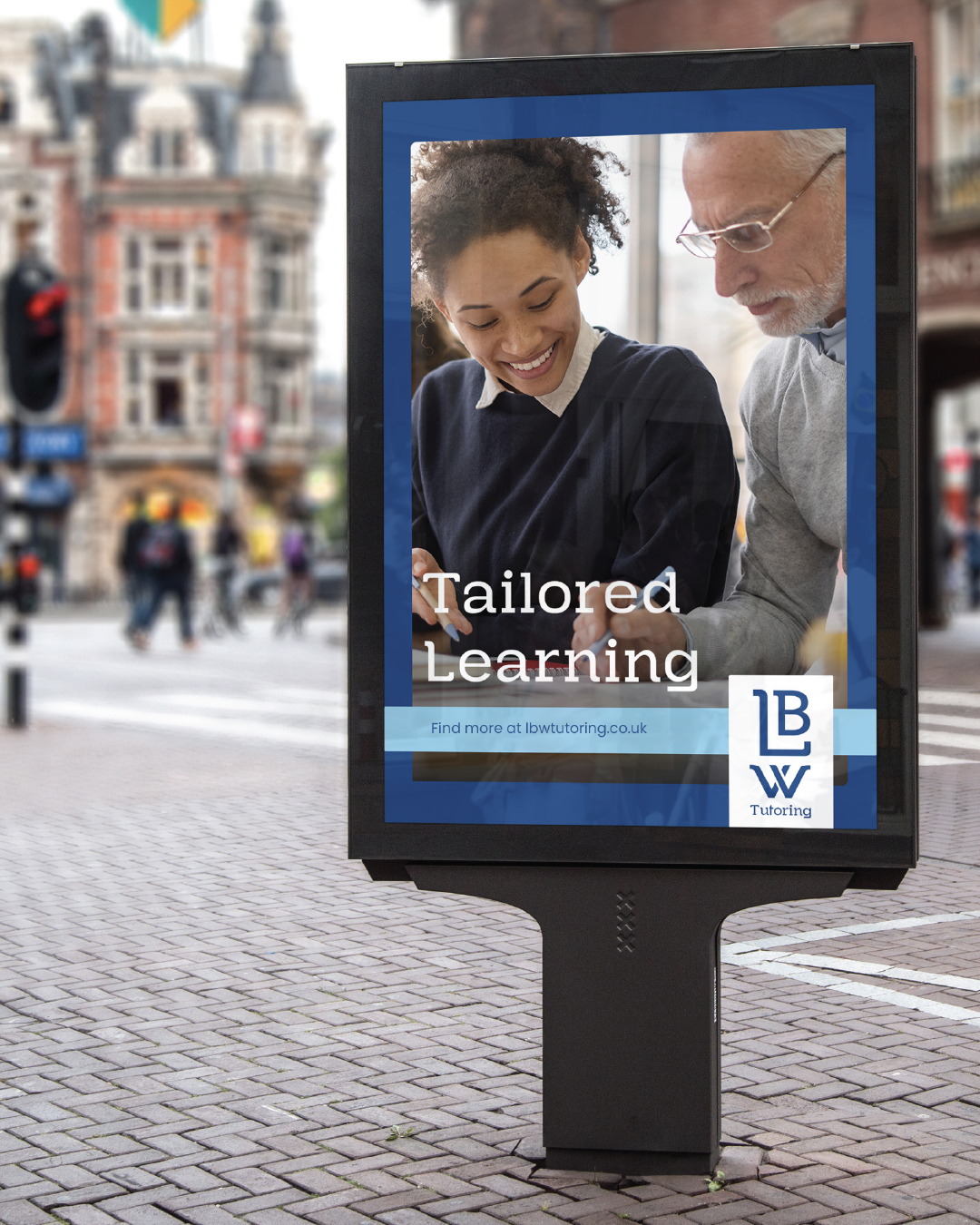
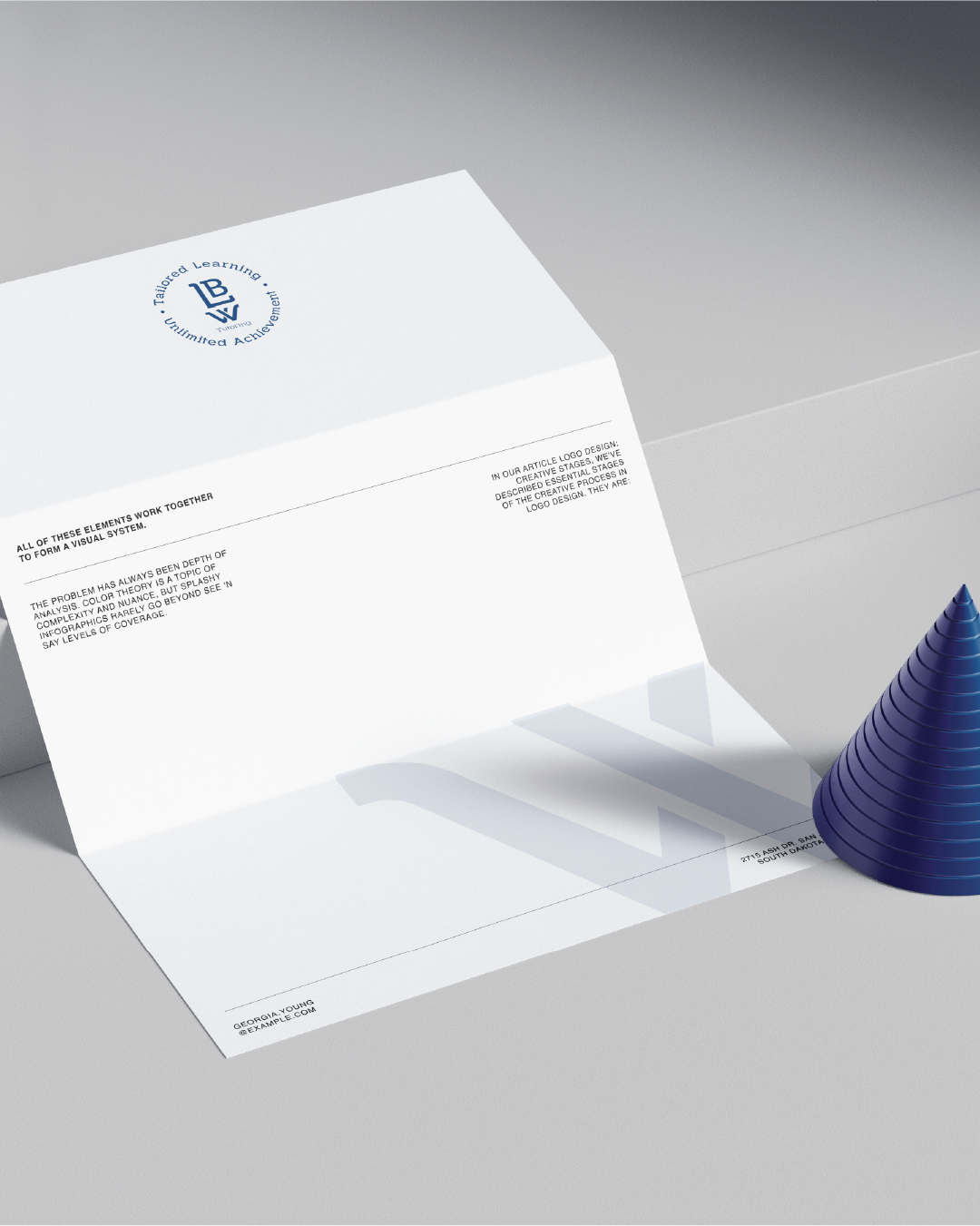
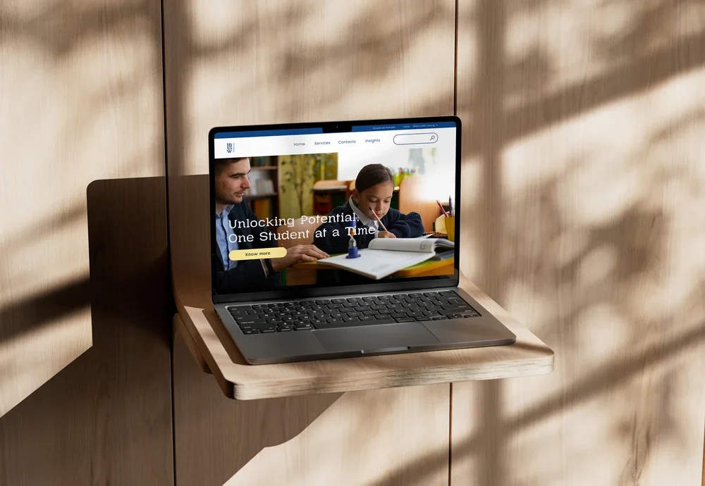
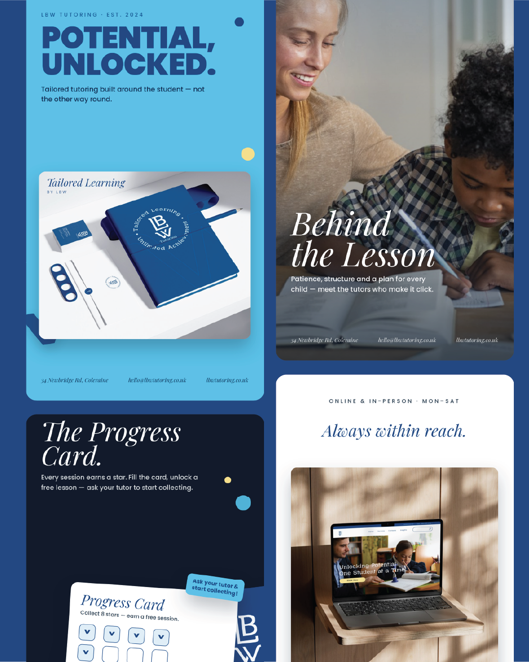
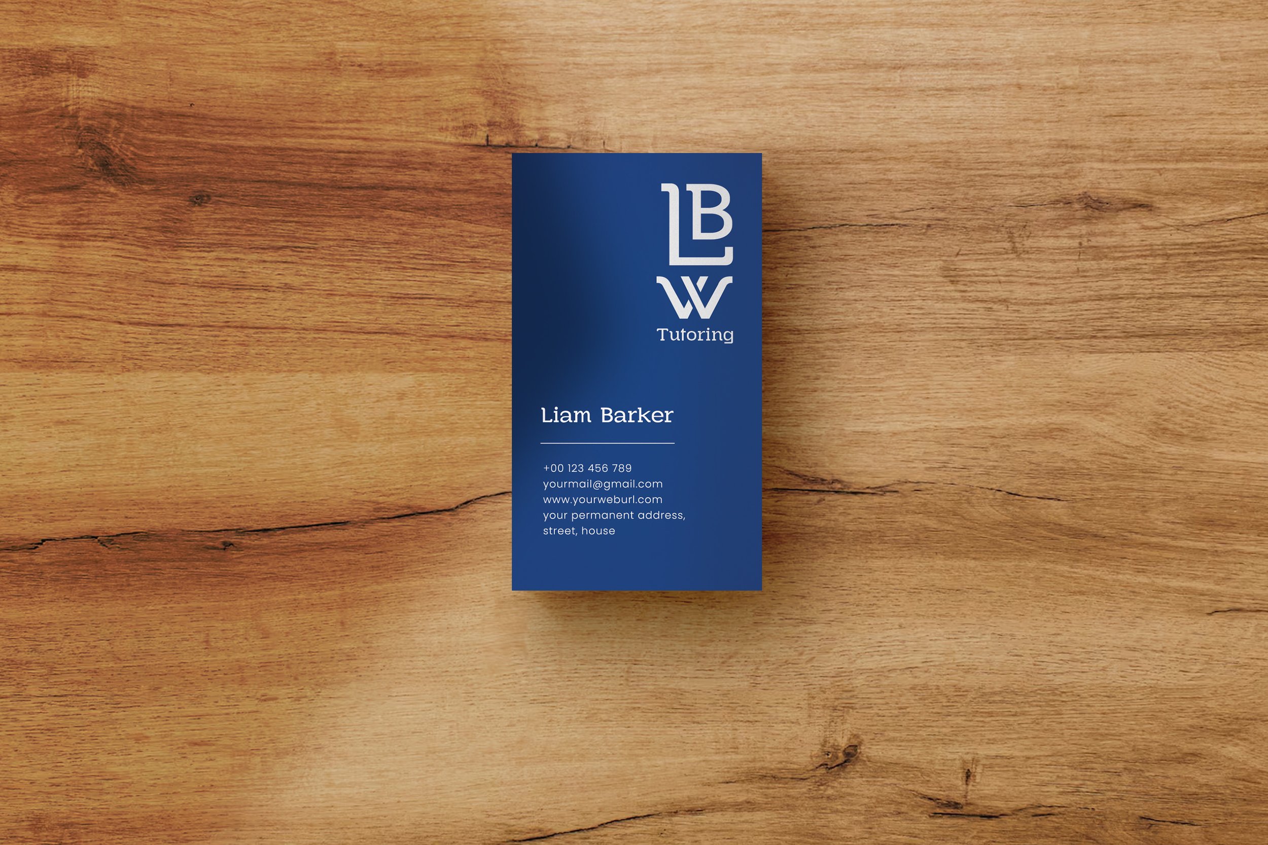
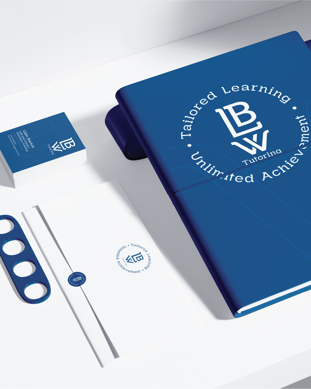
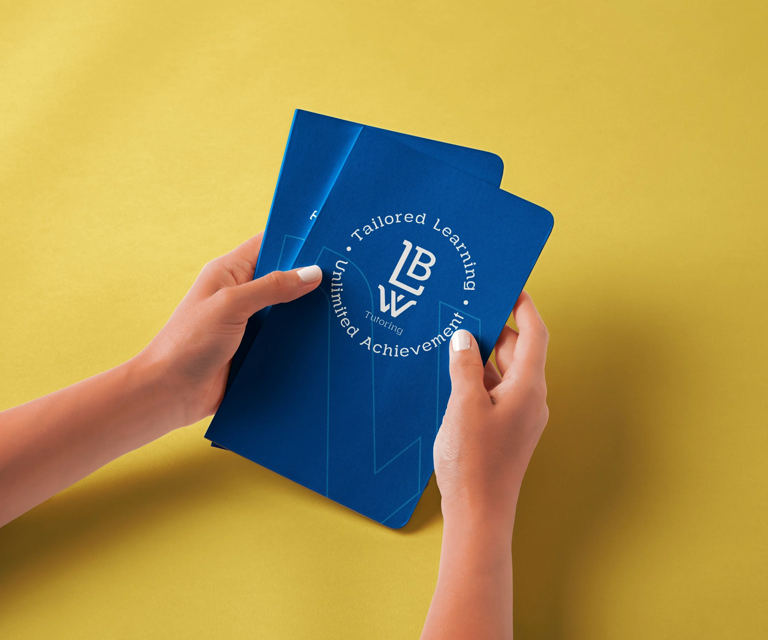
The design was tested across every touchpoint before sign-off, including business cards, branded stationery, pens, notebooks, billboards and the website. If it didn't work at every scale and in every context, we went back to the drawing board.
THREE WEEKS, START TO FINISH
Week one: discovery and strategy.
Week two: design and development.
Week three: application and delivery.
Everything was handed over to the client, ready to use from day one.

A NEW BRAND THAT LOOKS LIKE.
IT'S BEEN AROUND FOR YEARS.
"The goal was never to look like a startup. LBW needed to look like the trusted choice, established, expert, personal. The identity we built positions them to compete with national brands from day one."
In three weeks, LBW went from having no brand to boasting a complete, professional identity that works across key platforms, from school communications and parent-facing materials to outdoor advertising and branded merchandise.
Not sure what's holding your marketing back?
Our Marketing Diagnostic will find it within just two weeks.
No commitment on the first call / Work with our founders / We reply within 24 hours